Exhibition design encompasses the whole process of developing an exhibit, from the initial concept right through to the polished three-dimensional prototype. Having great staff and an innovative product are key in effectively promoting your brand at a trade show, but without a booth that grabs attention, the time spent investing in these goes to waste.
So how can you create a booth that successfully captures people’s awareness? Enhance the design concept for readability, clarity, and engagement. The idea that a person will only look 3-5 seconds at a stand before deciding to engage with it is a commonly cited figure for a reason: this is the time you have to convince an attendee to approach you!
The following are some exhibition design guidelines to inspire you to design a booth which communicates the message you want.
Exhibition Design Concept Guideline #1 | Use Clear Copy To Tell People What You Do
An often overlooked aspect of an exhibition stand design is the wording used on graphics, walls and printed media; but these are the words that communicate to potential customers!
As a golden rule, make sure the words you use tell people exactly what you do. Having abstract tag lines may work for large multinational companies, as the majority of people know what they do already. But odds are, you’re more modestly sized, and part of improving your brand awareness is clearly defining your purpose and why you’re a necessity. Ask yourself, “if someone didn’t know what our company did/sold, would they know from reading this?”.
Keep any writing short and simple. Exhibition halls are stimulating by nature: attendees won’t have the attentional capacity to read an essay!
Choose a font that is clear and highly legible. Similarly, choose a font size that is appropriate for the surface it’s on, where it is, and where your stand is in relation to other spaces. You can adopt methods such as using different colours and fonts to break up text, but keep this to a minimum.
Similarly, keep messages captivating and inviting to help generate intrigue.
A great template to follow is presenting text information in the following hierarchy:
- Who you are
- What you do
- What you can do for people
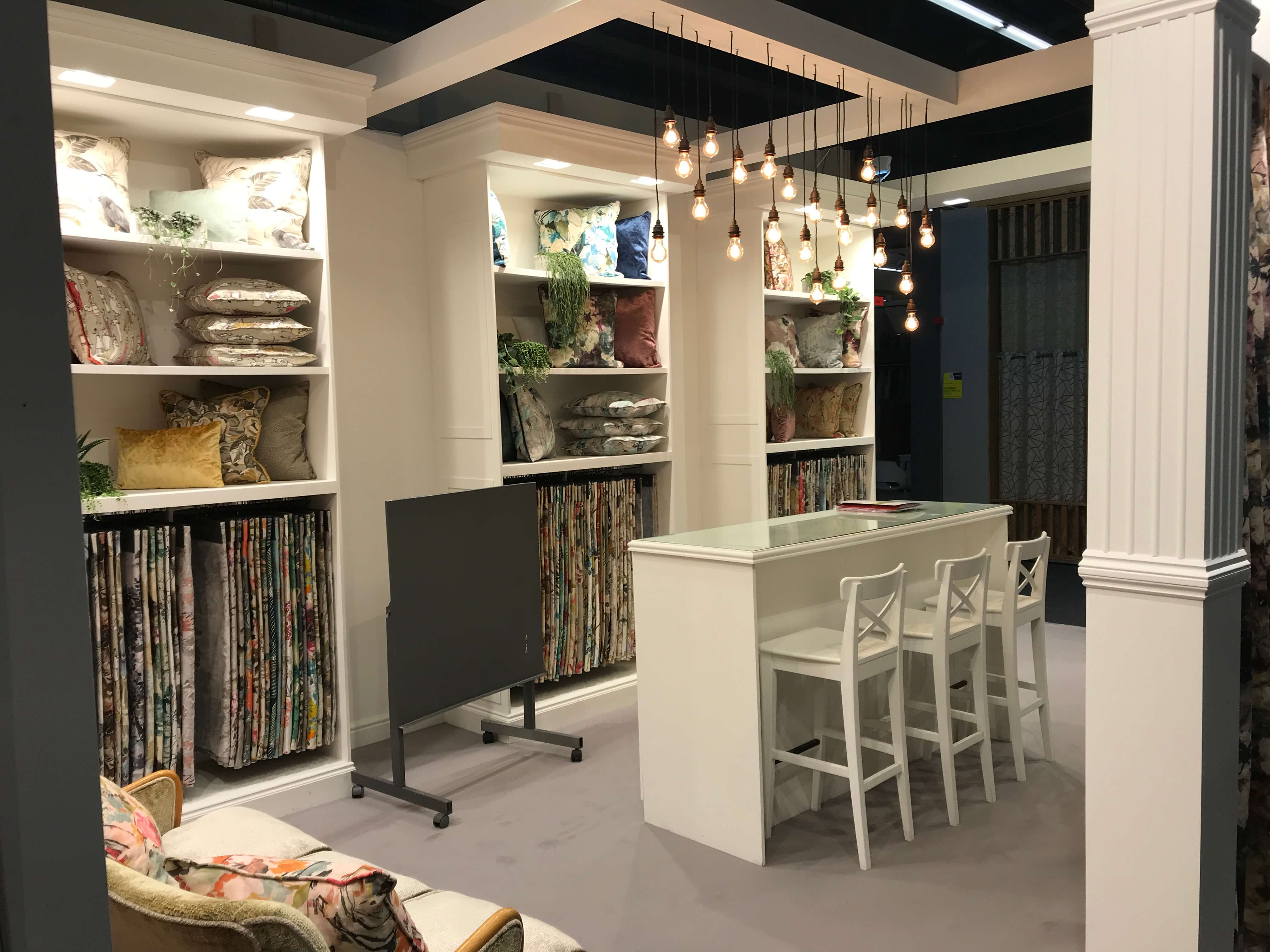
Exhibition Design Concept Guideline #2 | Use Images and Photos To Show People What You Do
If pictures paint a thousand words, and words convey strong messages to your audience, imagine the power images can have on your exhibit!
Only use pictures that are in keeping with the overall tone of your exhibit, and that will connect with your target audience. Images and text weave together to form the overall artwork, so make sure they work together well and give the same message as one another.
Images and photography are incredibly poignant in influencing emotions and intentions in passers by; they have the power to help tell your business story in a way that resonates with a range of people from your target market efficiently. The images you use should convey an idea or value that is desirable to people and leads them to the conclusion that you have something that they need.
It can be easy to get carried away here, but try to limit the amount of images featured on your booth appropriately. While showcasing the sheer variety of services or products your business offers works well in some selling spheres, visually, it can be overpowering and dilutes your key message.The fewer images you put on a surface, the bigger you can make them, improving their clarity and impact.
Exhibition Design Concept Guideline #3 | Use Exhibit Layout Design To Guide Attendee Engagement
Exhibit layout design should subtly guide attendees to engage and use your stand for the purpose you have in mind. Designing a stand that takes user experience into consideration can help optimise the space for the use it’s intended for. No two shows are the same, so it’s beneficial to be clear about your objectives for your exhibition attendance.
Are you selling products?
Are you giving away free samples of your products?
Are you trying to arrange discussions with potential buyers?
Are you trying to showcase your new service?
There’s not necessarily a ‘right’ way to design the layout of a space, but the above objectives might call for emphasis on different parts of the exhibition space, and encouragement of traffic to different areas.
For example, if you imagine a company that wants to promote its new line of shoes, it makes sense for their exhibition booth to feature their shoes as their focal point. A large wall display with lighting to draw attention to the shoes would work well, as would avoiding noisy graphics around areas that would draw this attention away from the shoes. They might also create aisles and guide foot traffic towards this feature, or design the angles of features such as shelving, graphics and racks to point towards the shoes.
Similarly, if you’re adopting a technique to entice attendees such as a competition, showcasing a product, or giving away freebies, you’ll want the layout of the booth to allow for this in the most effective way possible. Having these product giveaways at the front of the booth would be the most visible option, but risks attracting ‘giveaway grabbers’ that your staff might struggle to engage in conversation. Your stand should both attract attention and be able to generate conversation. You’ll want a healthy mixture of visibility, as to attract the largest amount of people possible, with placement that requires passers by to actually ‘enter’ your booth. This way, you’ll have attracted a good number of people, and give yourself the best chance of selling your products or services to these people.
Exhibition Design Concept Guideline #4 | Have An Exhibit That’s Clear and Clean
Your stand should be clean.
While that might seem like an obvious point, a surprising amount of people exhibiting will leave unsightly boxes or leftover lunch somewhere in their stand. If you’ve invested time and money into exhibiting as a marketing project, you want the aesthetics of the stand to be immaculate, rather than falling at the last hurdle. Presentation is key to any visual marketing, so having visible disorganisation has a knock-on effect of portraying your business as disorganised! If you know there will be litter associated with what you’ll do on the day (for example, packaging from the free products you’ll be giving out), integrate storage into your booth for keeping any products or litter.
Finally, the fun part: creating colour designs that demand attention, and achieve your communication goals. It’s worth knowing that colours can affect both mood and memory, and you can certainly use this to your advantage. There’s a reason that ‘Stop’ signs and ‘Sale’ graphics are usually depicted in red – this colour is related to urgency (‘act now!’) and tends to be easier to recall because of this. While you don’t want to pick colours which clash with your branding (such as your logos) or surroundings, there are still plenty of options for what colours you could use. You may also wish to pick different colour schemes for different types of events and the associated attendees. The emotion you wish to put out there may be different for B2B exhibitions compared to B2C exhibitions, for example.
—
Putting together a flawless exhibition design may seem like a daunting task, but this process is no doubt the most important part of exhibiting. Clarity is key in presenting your company’s product and prompting the desired behaviour from attendees, giving your exhibit maximum impact.
Looking for help with your design concept? DD Exhibitions Ltd design and build high quality exhibition stands, taking pride in every detail from concept to delivery. If you have any questions about your project, contact our friendly team who will be more than happy to help you!