Exhibition Stand Design Tip: Work Within Your Means
No matter which exhibition, event or expo you attend, there will always be “big players”, with enormous budgets and what seems like acres of space for their stand. They might be so renowned for their exhibits and giveaways at events they attend that people actively seek them out to see what they’ll have on offer this time around. It’s natural to have the immediate reaction of “I want to be bigger and better than them!”, but not everyone has the budget and staff to make that a reality.
Not to worry though, many avoid these larger exhibits and the crowds they tend to gather. There’s no benefit to planning for a booth that is outside of your budget, and impossible to implement with the staff and time you have to dedicate to this project. In fact, having a smaller and more intimate, personal space can really work in your favour!

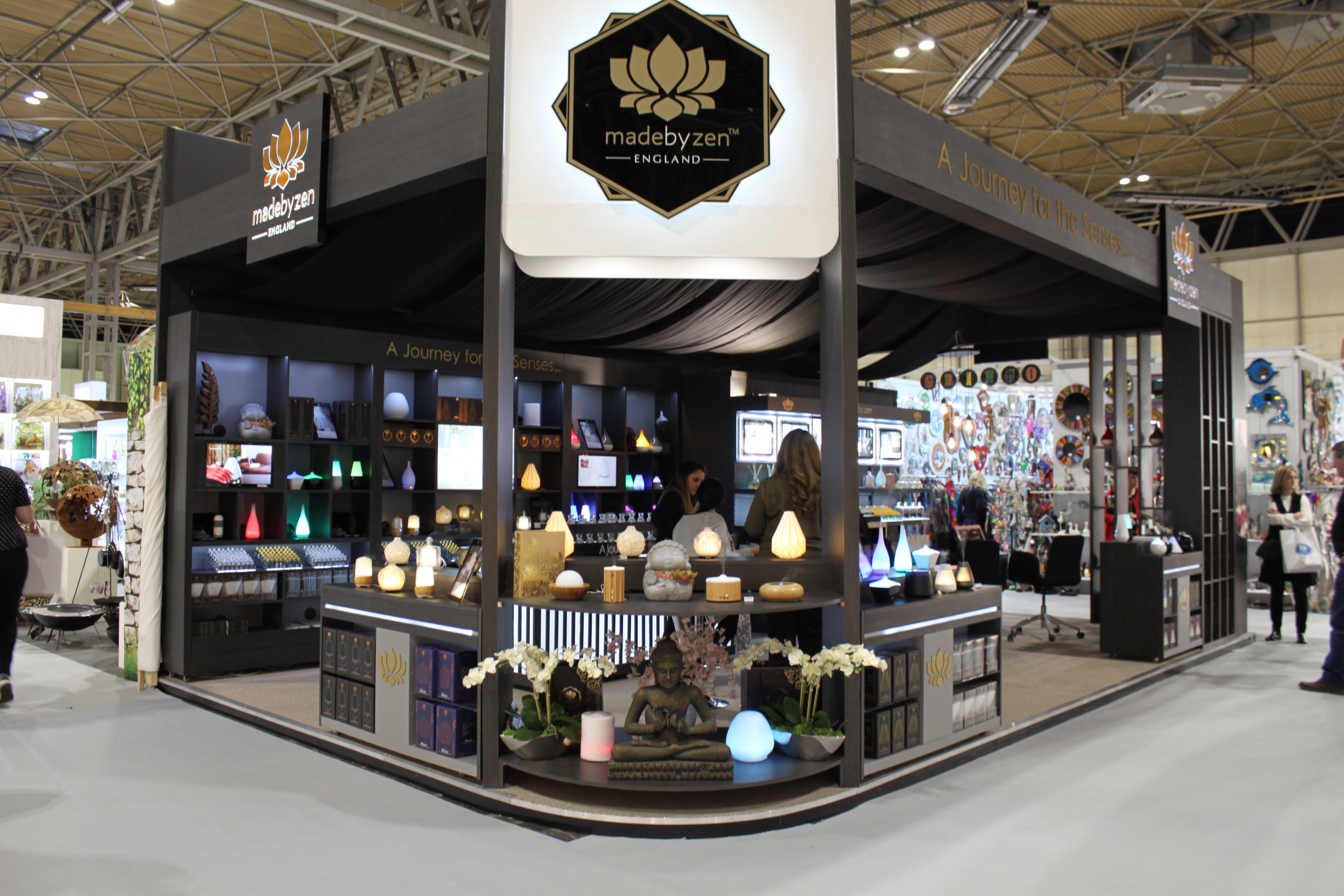
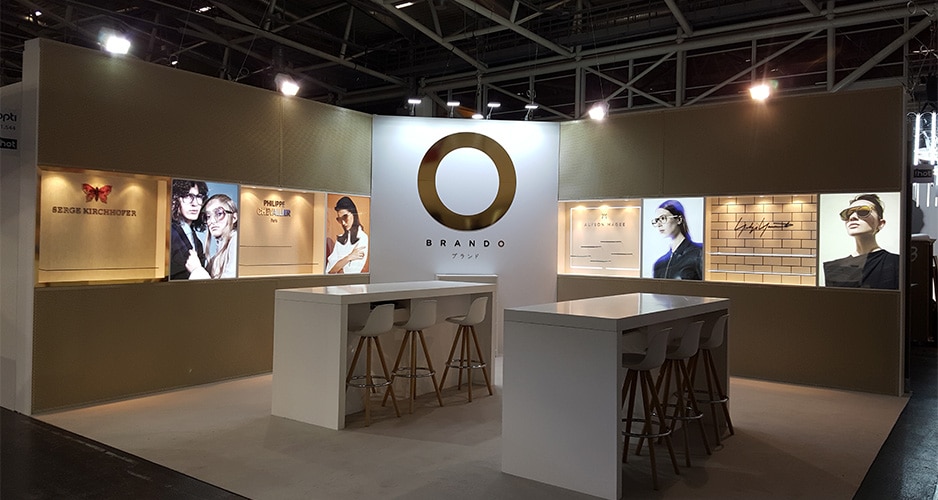
You can structure your smaller space to be more appealing to passersby through experimenting with layout, backdrops, props, lighting, and design details. Having a clean, enticing space can far outweigh the alluring features of a larger stand. If you have a smaller exhibit, take care not to overload the designs and graphics on backdrops and screens; you have slightly less room to play with here than larger stands. Use your size to your advantage by really taking care of small details such as rustic, tailor-made, or visually interesting interior design. Even the smallest decorative details such as flowers, lamps, or pillows, can substantially add to the mood and style of your exhibit. Don’t forget to bring your best products, too!
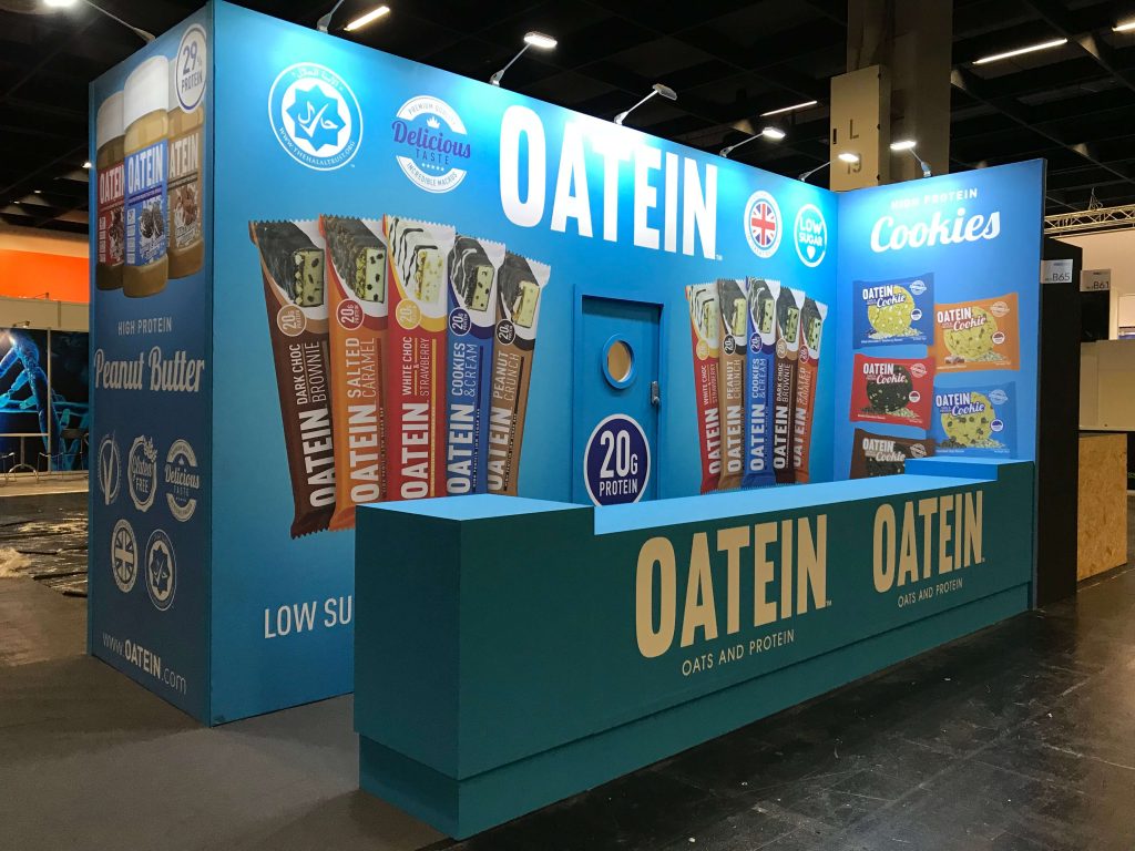
On the flip side, maybe you do have more in the budget to play with, and either want a more intricate design or a larger build. Having a custom or semi-custom built stand gives you an extra degree of flexibility, particularly when working with an external contractor to help guide you through this process. An important note here, is to remember to keep to your own company’s branding. Your design needs to be instantly recognisable to people who are familiar with your brand, and memorable to those who aren’t. Features such as colouring, signage, logos and stylistic details can all promote the ‘look’ of your company, and add to the experience of attendees.
Exhibition Stand Design Tip: Offer a Relaxed Environment
Exhibitions can attract crowd sizes as large as 40,000. Having that level of footfall can be hectic, and quite overstimulating to a great many of attendees. Combine that with the amount of salespeople present, pushing a hard sale, and it’s easy to imagine that people might want a bit of downtime.
It’s easy to create an atmosphere within your booth that evokes a sense of tranquillity. Lighting plays a real part here, and can really have an effect on moods of those visiting your booth. Alongside this, it can also be a very powerful tool in directing attention to certain details, features or products within your booth through direct lighting, and the creation of shadows.
Perhaps even more importantly, you may choose to feature a space in your booth specifically for “down time”. Having comfortable and aesthetically pleasing furniture serves to both create a seating area to attract guests seeking some solace from the hectic aisles, and as an attractive feature to add to the themed interior. Including other ‘home comforts’ such as provisions for hot drinks and snacks act in the same way as plush upholstery in instigating a feeling of trust and positive sentiment towards a brand.

Exhibition Stand Design Tip: Use High Quality Materials and Graphics
Investing in quality over quantity will help you in the long run.
You should make sure that when printing, or giving over design packages, you have the highest resolution images and graphics. It might look high quality when you’ve used it on your website, emails or printed media, but how will it look when blown up over a large screen? As a rule of thumb, images should be 300 ppi (pixels per inch) and above at the size they’ll be printed at.
As an equation, this would be number of pixels / 300.
You can also work out the maximum size an image can be printed whilst retaining its quality on Photoshop. This blog post outlines how to do so. However, if using a contractor to work with on designing an exhibit, your production team will be able to guide you on whether any prints will be sufficient quality based on the graphics being used.
As well as graphics, using high-quality materials both in the build, electrics, furniture, design features and freebies will give the best impression possible of your products and company. If your stand represents what you have to offer, doesn’t it make sense to show the quality of your offering through the quality of your stand?
Exhibition Stand Design Tip: Implement Audience Engagement Tactics
Perhaps the biggest goal of exhibiting at an event is to draw attention, and planning to engage a possible audience is at the heart of this. So what tactics might you adopt?
- Depending on the scale of your booth, timetabling in demonstrations of your product or service at particular intervals in the day from an experienced member of staff can help draw a crowd and allows you to communicate to multiple people at once.
- Running a competition or prize draw: which can act as an opportunity for you to collect details from people (for example, using a business card as an ‘entry’) to allow you to follow up possible leads.
- Giving out “freebies” provided they are useful, relevant, and placed appropriately in the stand.
- Provide something that attendees might want or need, whilst linking it back to your company or product. For example, you might want to provide a drinks station, and could use the opportunity to brand the cup or bottle.
- Provide the opportunity for audience interaction, in a creative way. How could you promote discussions and a community around your product?
